Label designs - before the beginning!
Our label designs have changed a lot over the years. The first label we did for our cider was from before Llanblethian Orchards properly began.
Llanblethian orchards was founded in 2008 and our orchard in Llanblethian was predominately planted between 2006-2008.
Before then I made cider as a hobby for home consumption. As a punter I attended the Welsh perry and cider society festival in the Clytha Arms every year and had a great time drinking all the wonderful ciders from local producers.
I decided in 2007 to take a barrel along to the WPCS festival to get some advice and see how it compared. I hadnt decided on a company name at that point and had to make something up quickly.
A loose translation of Llanblethian is church of St Blethian. With blethian translating roughly as wolf’s cub. Hence from this it was called wolf’s cub cider. Perai eryr lledaeniadis is a rather daft name for the perry. Translating as spread-eagled perry. Both a joke at what it does to you and named after a pub in Cowbridge called the spread eagled inn. A name which still makes me chuckle, can’t imagine it being very reputable!
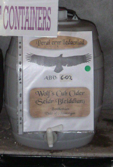
Label designs at the start
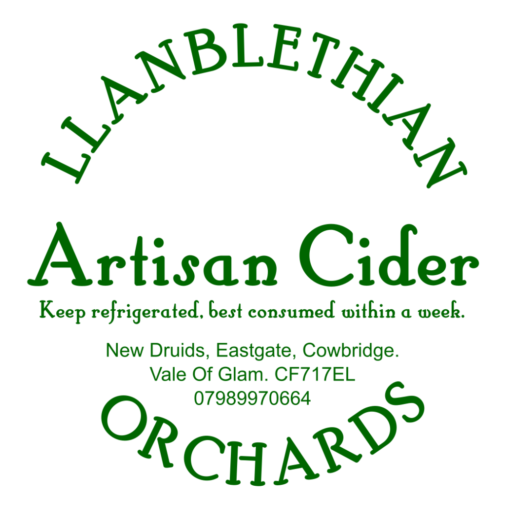
When I started Llanblethian Orchards in 2008 I was only selling a few 5 gallon plastic barrels of cider. Both at the welsh cider fesitval to fund the trip and a few pubs.
Back then most cider was sold in plastic poly barrels put straight up on the bar. There was space on the barrel for a small circular label and that was all that was needed.
For most of us cider makers then bag in boxes with attractive labels were a distant dream.
Can’t say im sad to see the back of poly barrels mind. They were a pig to clean, if you could even get them back from the pub. Only lasted a week before going to vinegar and the taps and rubber seals kept breaking.
Welsh perry and cider society festival
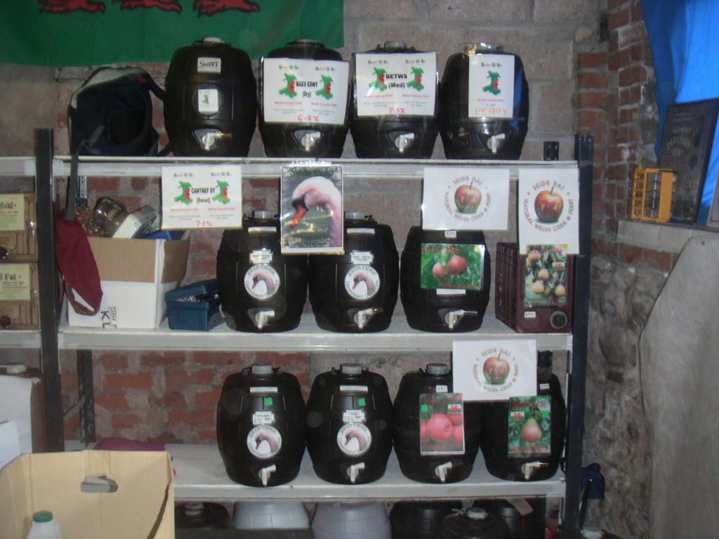
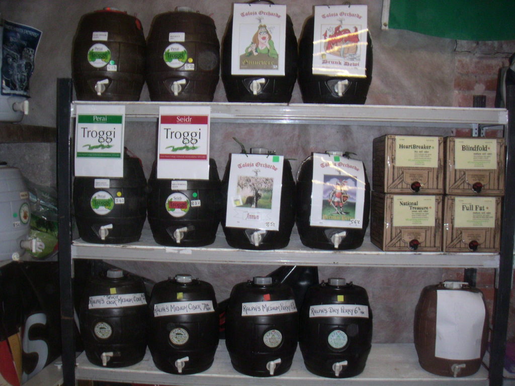
One of the biggest sales of the year for all us small cider makers used to be the Welsh perry and cider society festival. Held on the bank holiday at the end of May in the Clytha Arms each year.
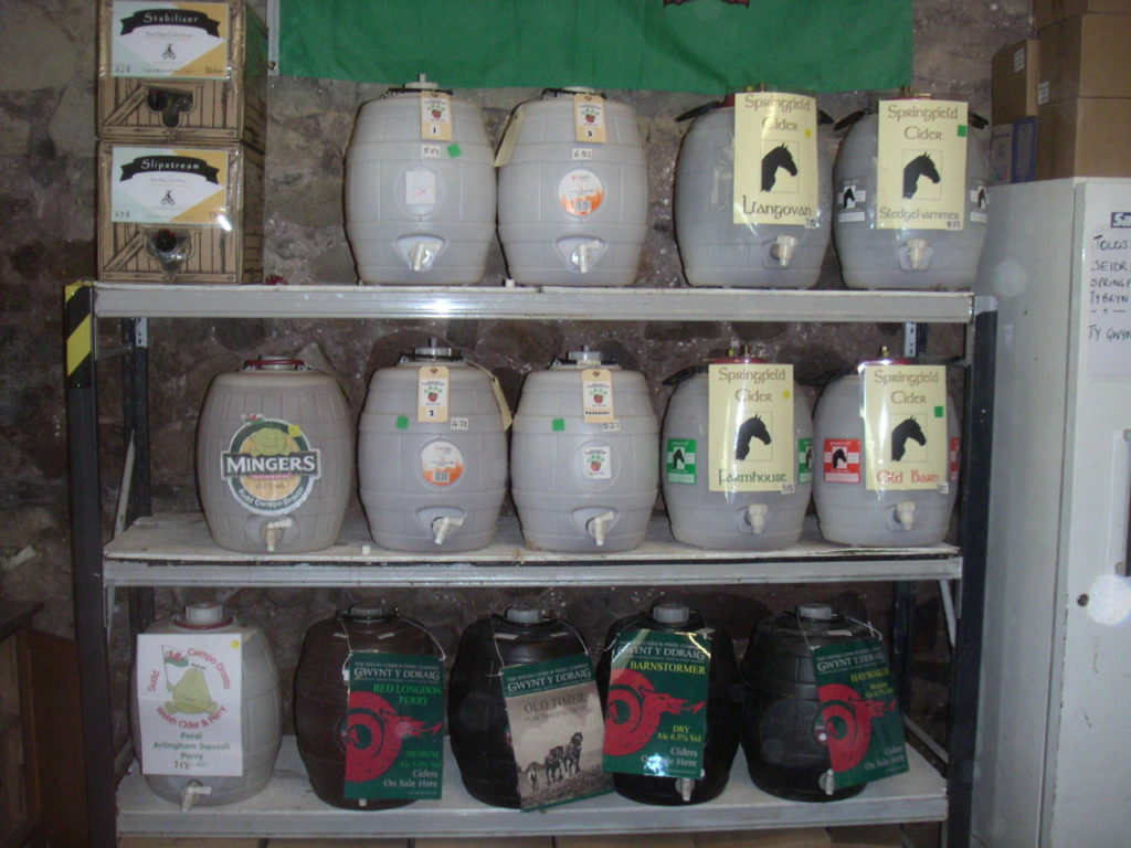
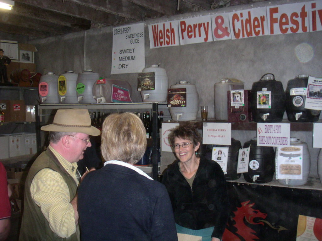
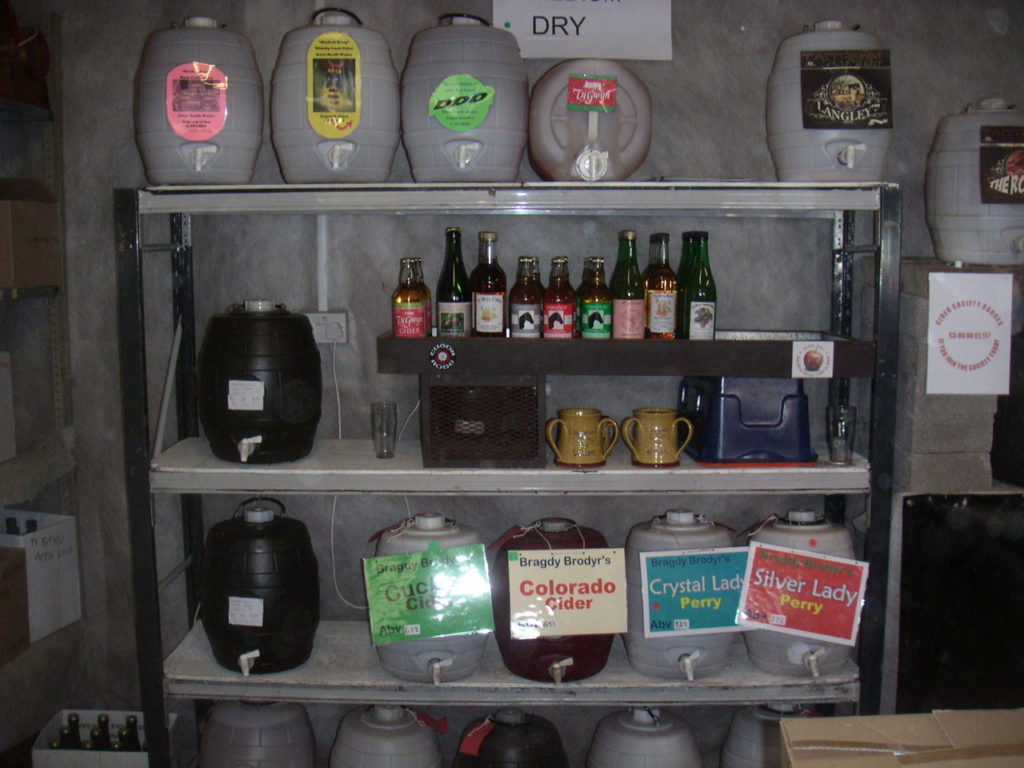
All the Welsh cider makers would put their plastic barrels behind the bar and stand in front selling them. To everyone present it soon became apparent if you put a large label in front of the barrel you would sell more. It thus effectively became an arms race of garish A4 sheets.
Below are a set of photos of the 2007 WPCS bars. The eagle eyed will spot several now well known cider makers before they settled on their current designs. As well as a few that sadly no longer exist.
Who can you spot?
Well I guess I need an A4 label then...
For the 2008 WPCS festival I really needed an A4 label. And in my truly organised fasion I didnt bother thinking about it till the weekend of the festival!
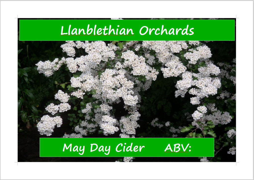
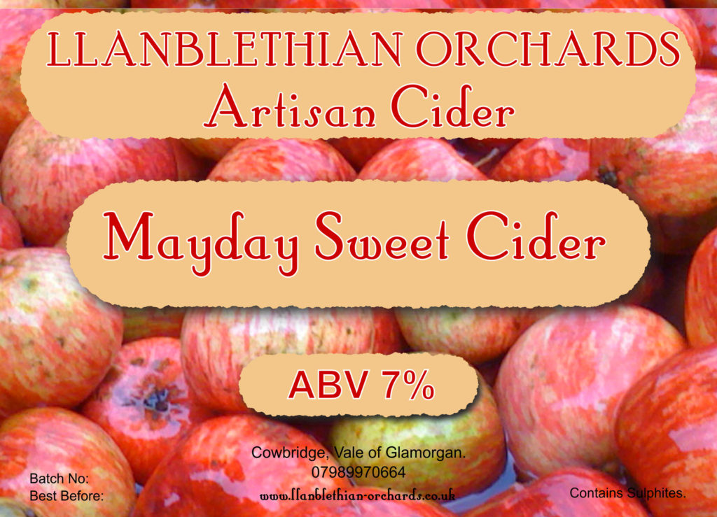
As such here is the orignal label for May day, one of my biggest sellers. The photo is of a hawthorn tree from my orchard in Llanblethian.
As hawthorn is traditionally associated with Spring and May in particular I thought it appropriate. The label was made up in open office as I recall.
The oval era
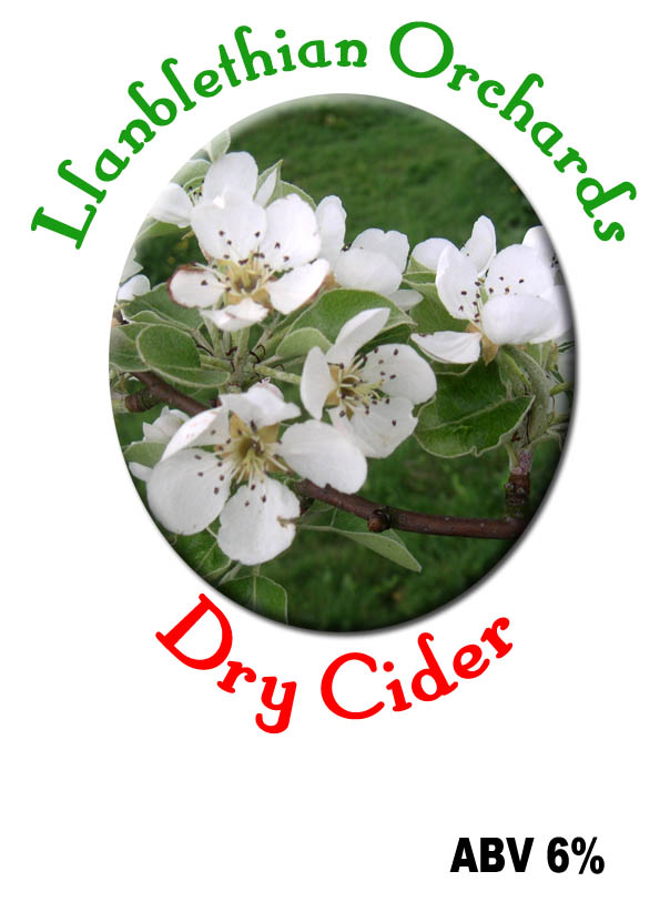
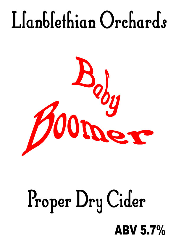
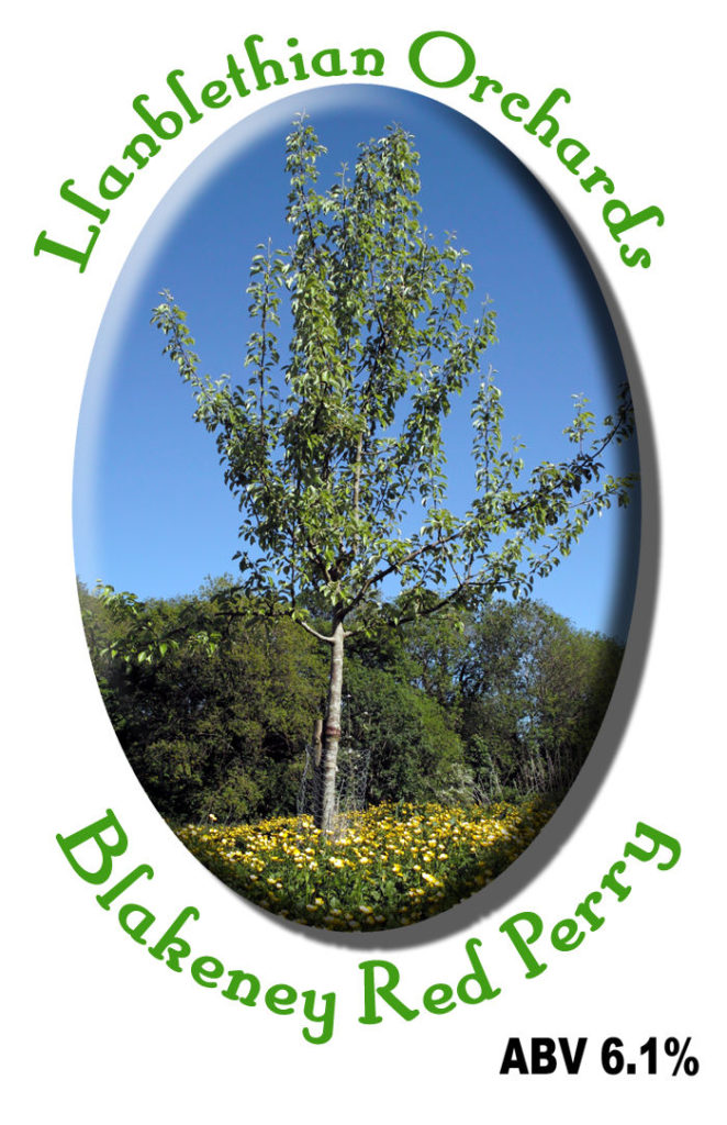
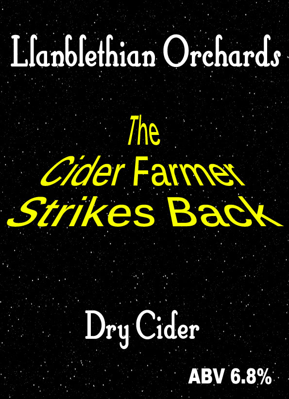
Between 2010 and 2012 I put together a set of oval labels featuring images from my young orchard in Llanblethian. As they were only really used at the WPCS festival not much time went into them.
Looking back at them now makes me laugh. The dry cider label is a photo of a perry pear flower from Llanblethian orchard. Mostly as I didnt have and good photos of apple flowers at the time. The tree in the Blakeney red perry label is actually a Hellen’s Early tree from the orchard. The trade descriptions act had nothing on me back then!
The baby boomer label is a nod to my mate Andy. Who conceived his first child at the WPCS festival the year before. Baby in every pint…
Have to say I still like the cider farmer strikes back. Perhaps it will have to make a come back. Hmm…
The bag in box cometh
From 2013 I started selling a lot of my cider in bag in boxes rather than poly barrels.
The 20L boxes have space to afix an A5 label to them. And from my experience with the WPCS festival I knew the bigger the label the better.
The powers that be were also looking more closely at cider makers in general.
As such having contact details, allegen information, batch number/ best before for traceability became a must.
The new look may day label was drawn up in inkscape an open source drawing program I still use to this day.
Help from creative rural communities
In 2014 I was told about grants for marketing from Creative rural communities in the Vale of Glamorgan.
I successfully applied for a small grant to have a label professionally designed for my bag in boxes.
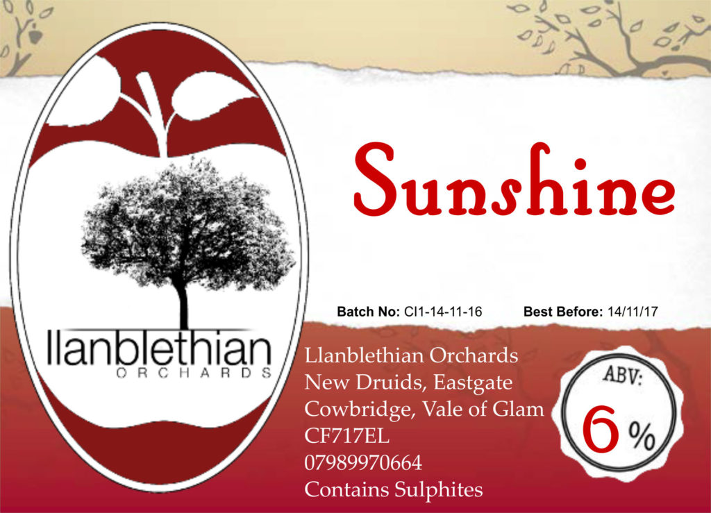
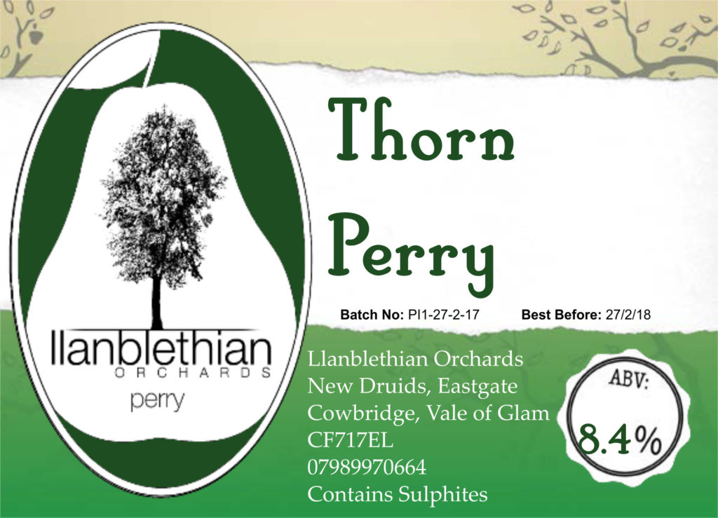
Dischro Creative in Abercarn designed the logo and new labels you see here. One label for my cider range and one for my perry range.
The trees used on the labels I’ve always liked and the font layout for llanblethian orchards is wonderful 🙂
They were used for the next few years on my bag in boxes and helped the business grow as I sold to more and more pubs around South Wales.
Lets bottle some cider
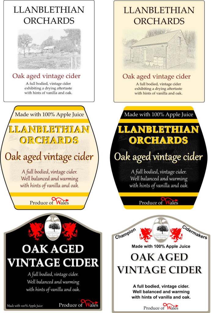
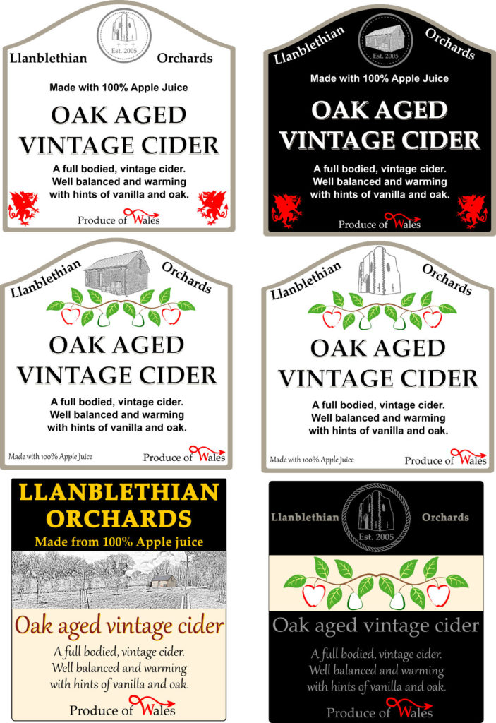
In 2015 I decided I wanted to bottle some cider. I couldnt afford to pay to have a label designed at the time. The winter months are an off time for cider making so I decided to have a stab myself.
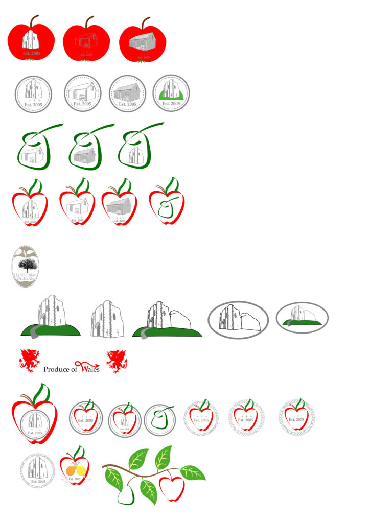
First of all I tried to draw up a small logo for the bottles. I felt the logo I had designed would’nt translate well at a small size.
The image below shows the ideas I was playing with. You can see the origin of the apple and pear branch coming together as they progress.
Below that are 3 sheets of label ideas. As you can see over time the golden branch with fruit on a black background coalesces into it’s final form.
After considering them all the black background and golden branch / text was chosen as the design to take forward.
As much as anything gold on black stands out clearly and the gold could be foil printed even. From my early years with the WPCS festival I care more about clear visibility at range than anything else. When my product is on sale I want to be able to always clearly identify it from the other side of the bar 😉
The simple logo could also be altered as needed and works at any size. It has since been used on everything from embroided clothing to a laser cut wax stamp for the ice cider bottles.
Bottled cider final label designs
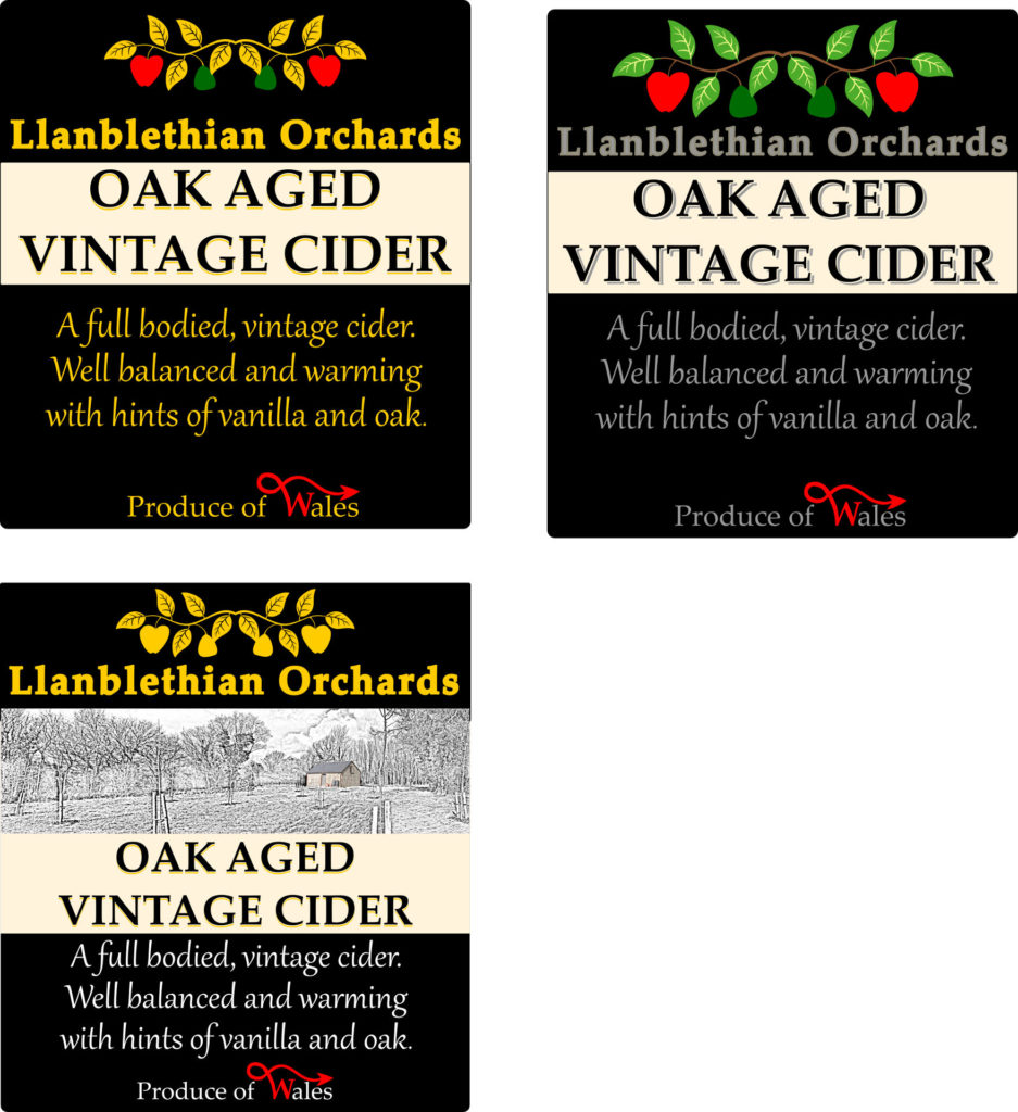
Here is the final design for the first bottle labels I did. It was a 2 label bottle design with a rear label with all the information on.
Truth be told I only used it once then changed the design to a single label design. Simple reason being two labels is twice the number of labels to stick on. Not to mention some hand labelling machines are only really setup for single label setups.
Live and learn I guess.
Below are the streched labels I have used since. One labels is so much easier to work with!
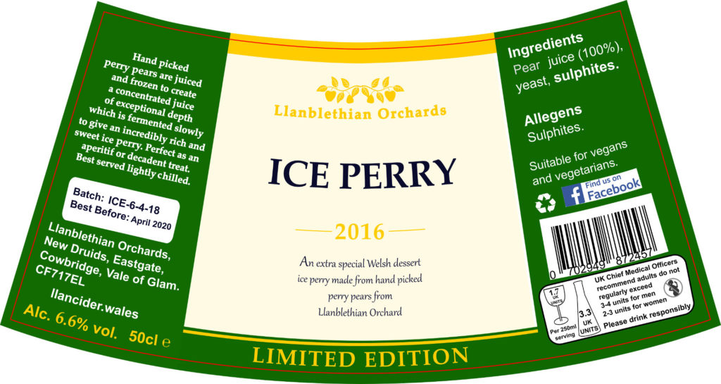
On an aside. Below that is the ice perry label. As the bottle is tapered the label has to be curved with a tighter curve at the top than the bottom.
Although I love those volcano like bottles I hate changing the labels. It’s a ruddy nightmare…
I suppose I should have consistency in my label designs...
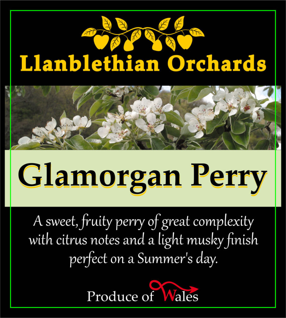
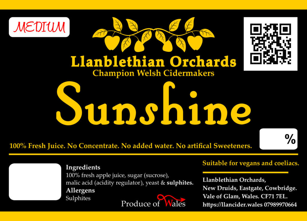
By 2017 I had a whole range of products / marketing materials featuring the new golden branch logo. Yet the bag in boxes still featured the old designs.
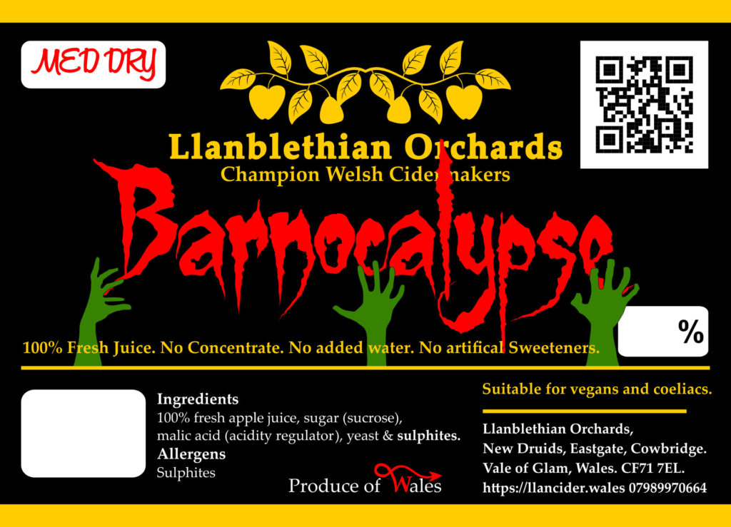
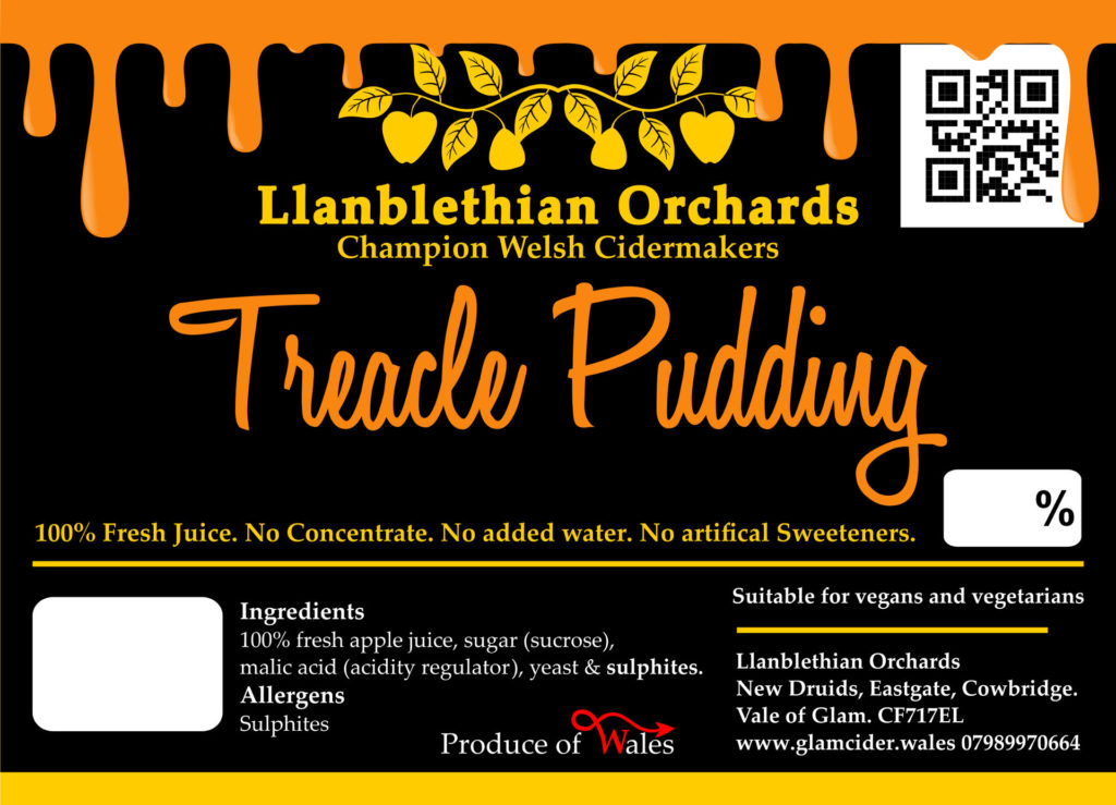
It was at this point I decided to update the bag in box designs to the new style shown below.
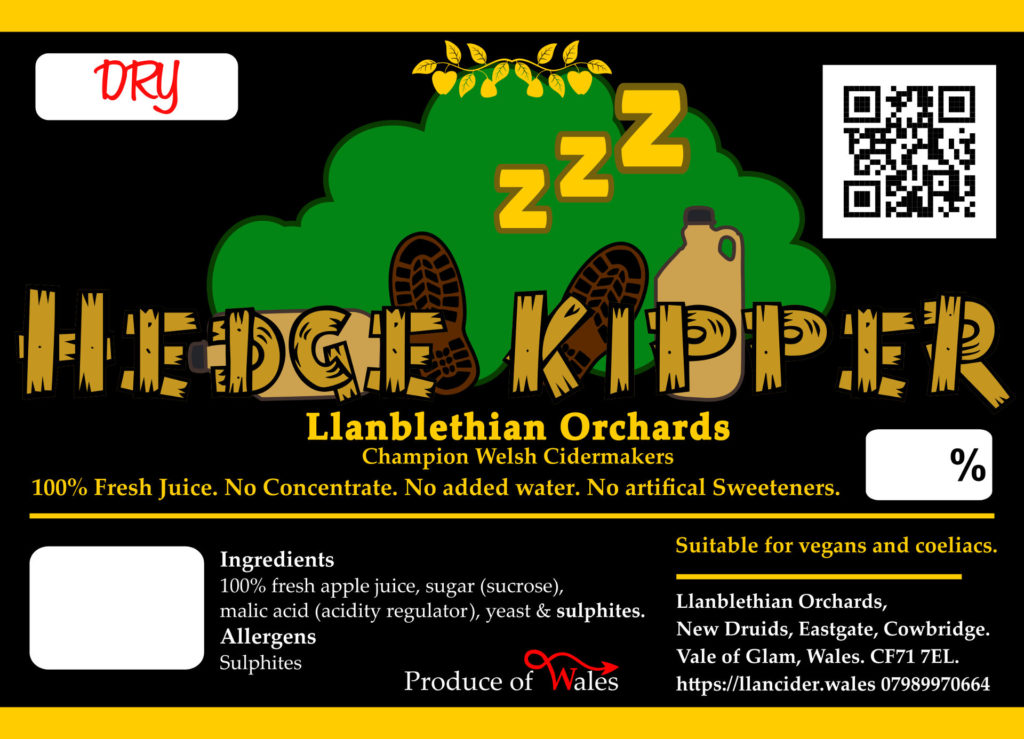
Over time i’ve played around with the labels to alter them for my specials. Hedge kipper being my new dry cider which will be replacing royalist as my standard dry.
I have to say im pretty pleased with the end result. I can always spot if it’s my cider on when I enter the pub. RESULT!
I hope this trip down memory lane has been informative. It’s been some effort ratting though all my old files to find all these images. Gethin’s old cider names still crack me up. Mingers was a hell of a cider 😉

0 Comments